Marketing and Communications
Strengthening NEOMED’s brand to advance healthcare education and research.
Tier 1
University Logo
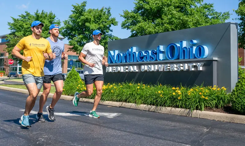
The Northeast Ohio University main logo and its limited use secondary option serve as the overarching entity to which all other entities are connected.
Iconic and elegant, this design approaches the idea that knowledge is power, shown through the flame rising above the pages of a book. Blue is the color of inspiration. Its cool vibration is calm, relaxing and subtle in its intensity.
There is an open flow of strength and communication in the design that correlates with the typeface and description.
Do not modify it in any way, as this will change the meaning of the brand.
Logo Placement & Orientation
The University logo should always be placed at the bottom (footer) of any marketing collateral. In the event the collateral includes other copy, urls or additional logos in the footer area, our University logo must always be on the righthand side and serve as a visual “final thought.”
Always leave enough clear space between the mark and any other applications. Use the lowercase ‘o’ as a guideline. Download the Style Guide for guidance*.
Never put text or images directly next to the logotype.
Minimum Size
Always refer to the minimum size requirements when scaling.
Height: 0.33″ or 24px
Width: 1.125″ or 81px
Color Usage of the Logo
Never change the color of the logotype. Do not change the direction of gradients. Spot colors should be used on all high quality prints. All other prints use the CMYK equivalents.
One Color
Spot Blue: PANTONE 300 C
Black & White
Black: C/0 M/0 Y/0 K/100
Reversed Out
CMYK White: C/0 M/0 Y/0 K/0
RGB White: R/255 G/255 B/255
Alternate Usage of Logotype & Icon
The approved University logotype is always recommended to be used; however, in some instances the logotype can be used without the icon.
Only Text
If only the text is to be used, please do not attempt to alter or recreate the text in any way.
Only Icon
The icon can be used by itself, especially when a small symbol is needed, such as a Facebook icon, Twitter icon or a favicon.
![]()
Shortened Logo
Should you require the shortened version of the logo, please contact the Office of Marketing and Communications at marcom@neomed.edu or 330.325.6618. Never use the shortened logo without approval. When using the shortened logo, the icon must be positioned on the left and never on top or on the right. Follow the same color guide as the full University logo.
![]()
Incorrect Usage
Always use the mark as shown at the top of the page.
- Never remove the flame and stack the logo.
- Never flip, rotate, add overlays of color or stretch the mark.
- Never recreate the logo.
- Never change the colors or place the icon on the right.
- Never have “Medical University” above “Northeast Ohio.”
- Never combine the full university logo with the shortened logo.
- Never change the font or distort the text that is a part of the logo.
- Be mindful of placing the logo on images and colors.
- Previous logos from the University should no longer be used on any University materials.
Contact us
Office of Marketing and Communications
Phone: 330.325.6618
marcom@neomed.edu
Chief Marketing Officer
Tonya Strong-Charles
tcharles@neomed.edu
Media inquiries
Phone: 330.325.6618
marcom@neomed.edu
We have experts who can comment on a number of health care topics